レイヤーを重ねるAdobe製品、premiereやphotoshopなどには描画モードというのがあります。描画モードの違いで見え方が異なります。
目次
描画モードとは?
Adobe製品にはレイヤーといって、画像の層、テキストの層などを一枚ずつ重ねて合成することで一枚の画像や動画を作成できます。
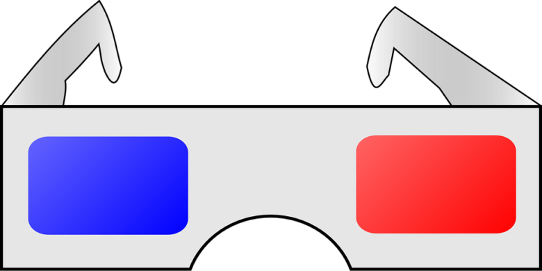
例えば下のセロファンのメガネも目で見る景色というレイヤーに赤青セロファンのレイヤーを重ねて合成しています。
重ね方が描画モード
レイヤーの合成(重ね方)の違いが描画モードです。
具体的な例を見たほうが分かりやすいと思います。
premiereを例に描画モードの見え方の違いを説明します。
今は下の層に黄色、上の層に青の画像レイヤーがあります。
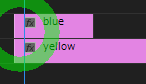
上のレイヤーの描画モードを変更していきます。
描画モードに6つのカテゴリがあります。
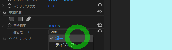
通常
通常ではblueのみが表示。不透明度が100%(透明でない)と上のレイヤーのみが表示される。
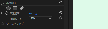
透明度が上がるとそれに合わせて下のレイヤーの黄色が見えて色が変わる
不透明度50%
不透明度0%
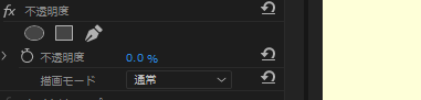
説明では下のレイヤーのカラーを無視するとありますが、透明にすれば下のレイヤーの色が反映されます。
premiereではディゾルブと変わらない感じです。
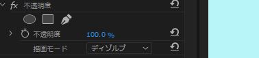
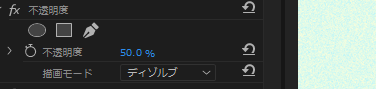
ディゾルブ
不透明度100%
不透明度50%
基本色と同じような感じ
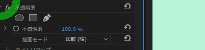
比較(暗)
不透明度100%
不透明度50%
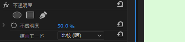
blueとyellowを混ぜたほうが暗くなるのでmixされたものが見えてる?
乗算
不透明度100%
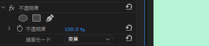
不透明度50%
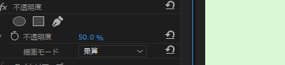
ペンの重ね塗りのような効果で元の色よりも暗くなる。黒があると黒になる
焼き込みカラー
不透明度100%
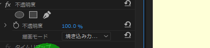
上の色を暗くしてコントラストを上げて下の色を反映する。
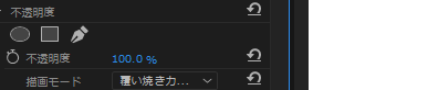
不透明では変わらない、写真だと効果が見やすい
焼き込み(リニア)
不透明度100%
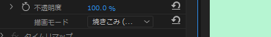
上の色を暗くして明るさを落として下の色を反映する
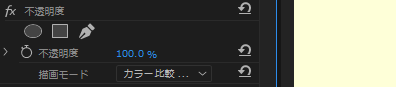
カラー比較(暗)
不透明度100%
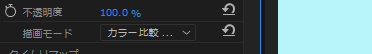
カラーを比較して暗いほう。個々のカラーチャンネルには作用しない
比較(明)
不透明度100%
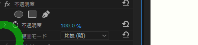
不透明度50%
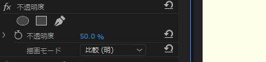
チャンネル値の明るいほうの色になる
スクリーン
不透明度100%
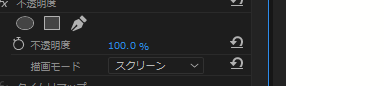
不透明度50%
光の足し合わせのように互いの色を重ね合わせたような効果。
明るくなる。
覆い焼きカラー
不透明度100%
不透明度50%
覆い焼き(リニア)
不透明度100%
不透明度50%
上を明るくして明るさを上げて下の色を反映させる
カラー比較(明)
不透明度100%
不透明度50%
カラー値を比較して明るいほう
オーバーレイ
不透明度100%
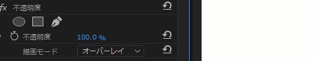
下の色の明るさによって乗算またはスクリーンする
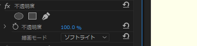
ソフトライト
不透明度100%
不透明度50%
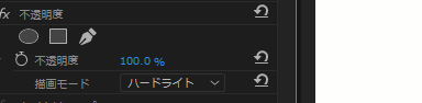
ハードライト
不透明度100%
不透明度50%
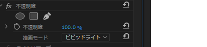
ビビッドライト
不透明度100%
不透明度50%
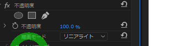
リニアライト
不透明度100%
不透明度50%
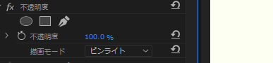
ピンライト
不透明度100%
不透明度50%
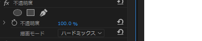
ハードミックス
不透明度100%
不透明度50%
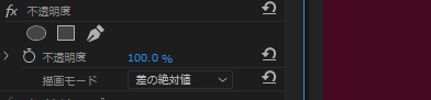
差の絶対値
不透明度100%
不透明度50%
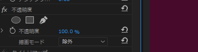
除外
不透明度100%
不透明度50%
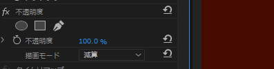
減算
不透明度100%
不透明度50%
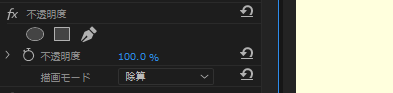
除算
不透明度100%
不透明度50%
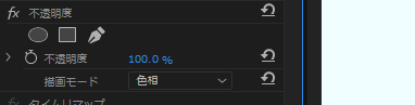
色相
不透明度100%
不透明度50%
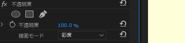
彩度
不透明度100%
不透明度50%
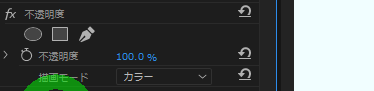
カラー
不透明度100%
不透明度50%
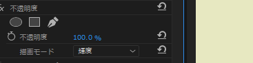
輝度
不透明度100%
[adobe公式]描画モードについて:https://helpx.adobe.com/jp/premiere-pro/using/blending-modes.html